

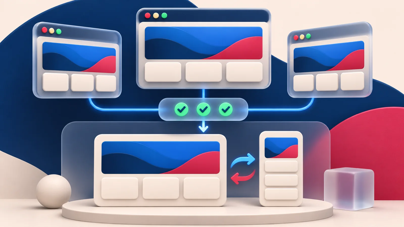
Modern CSS can simplify a WordPress redesign, but a new feature should earn its place by solving a real layout or usability problem. A visually impressive demo is not the same as a reliable page for your audience. Before adding another dependency or a large custom stylesheet, check what the browser can do and what happens when the newest capability is unavailable.
What changed in 2026
The Baseline 2026 overview tracks web-platform features becoming available across browsers during the year. Its list includes capabilities such as container style queries and @scope. Availability is feature-specific: the existence of a feature on a yearly list does not mean every device used by your customers has already been updated. Use current support information to guide adoption rather than a generic claim that all new CSS is safe everywhere.
Source: Baseline 2026 feature overview. News context checked November 15, 2026.
1. Choose modern CSS for a concrete problem
Start with the interaction or layout you need to improve. A card that must work in a narrow sidebar and a wide content area has different requirements from a full-width hero. Describe the expected behaviour at both sizes before choosing a technique. Prefer a small, understandable rule over a complex effect that exists only to show novelty. If a Gutenberg control already expresses the design cleanly, use it; custom CSS should fill a gap rather than duplicate an existing setting.
2. Check the audience before the browser demo
Review the browsers and devices that matter to the project, including older phones or managed work computers when relevant. Test the actual feature you intend to use rather than assuming a browser supports every nearby capability. Record the minimum supported experience in the handover notes. A brochure site can often tolerate a subtle visual enhancement being absent, while an enquiry form cannot tolerate losing its labels or submit control. Decide that distinction before writing the enhancement.
Example: Hypothetical example: A service-card grid uses a newer layout feature. Start with cards that remain readable in ordinary document flow, then apply the enhanced layout only where supported. Test long titles, a narrow screen, and enlarged text. A compatibility entry is useful evidence, but it does not test the content combinations in your design.
3. Build a usable fallback first
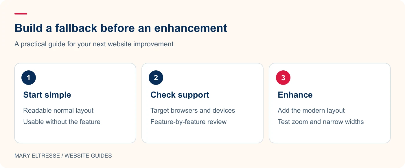
Create the basic readable layout with sensible source order, spacing, and accessible controls. Add the newer enhancement on top, using feature detection where appropriate. Check that removing the enhancement does not make content disappear or put a crucial button off screen. A fallback does not need to look identical; it needs to remain understandable and functional. Keep content and important labels in the document rather than generating essential instructions entirely through decorative CSS.
4. Make block styling predictable
Use theme palette and typography presets so individual blocks do not collect unrelated colour values and font declarations. Keep selectors local to the component and avoid broad rules that unexpectedly affect navigation or forms. BlockGlow can help scope styles to a particular block, but the CSS still needs review when the block is duplicated or reused. My plugin selection guide explains why a small targeted improvement is often easier to maintain than another overlapping styling system.
Example: Hypothetical example: A decorative heading effect looks good on a desktop but clips when a visitor zooms in. Keep the underlying heading as real text, remove fixed heights, and test wrapping before adding the effect again. If the enhanced styling fails, visitors should still be able to read the title and follow the page structure.
5. Test behaviour, not only screenshots
Resize the layout, increase text size, navigate with the keyboard, and try a long heading or missing image. These situations reveal whether the component is robust. Check focus visibility and motion preferences when adding transitions. A screenshot cannot show whether a dropdown is reachable or whether a card title overflows at an intermediate width. Ask someone unfamiliar with the page to complete the main task and note where they pause, because successful responsive design is also about clarity.
6. Leave a small maintenance trail
Document why the enhancement was added, which fallback remains in place, and how to check it after an update. Avoid scattering the same rule across theme files, block CSS, and a page-builder panel. Choose one clear owner for each component. Modern CSS works best when it reduces the amount of custom work the next person must understand. When the redesign is handed over, include the relevant design tokens and a concise list of intentional browser differences.
Your practical checklist
- Define the layout or interaction the feature improves.
- Check support for that specific feature and audience.
- Keep the basic layout usable without the enhancement.
- Use theme tokens and component-level selectors.
- Test keyboard access, text growth, and intermediate widths.
- Document the fallback and where the styling lives.
Frequently asked questions
Do I need a new plugin for every modern layout feature?
No. Start with native blocks, theme settings, and browser capabilities. Add a plugin when it solves an identified requirement more reliably than a small maintainable implementation.
Should every browser see exactly the same decoration?
Not necessarily. Prioritise the same usable content and tasks. Some decorative enhancements can differ if the supported experience is clear and the fallback remains functional.
Make your next website improvement count
Planning a block-theme refresh? Talk with Mary Eltresse about using modern CSS to make your website clearer, more responsive, and easier to maintain.