


Accessible web design is easier to discuss when it is connected to tasks: opening a menu, reading an article, filling a form, and understanding what happens after a button is pressed. Attractive colours and carefully chosen fonts matter, but they do not answer those questions on their own. A professional WordPress interface needs to stay usable beyond the designer’s ideal screenshot.
What changed in 2026
Chrome’s July 2026 web-UI roundup groups new platform capabilities around principles such as respecting user preferences and supporting natural interactions. That is a useful direction for design work, but browser features do not automatically make a website accessible. The checks below are practical starting points for a review, not a claim of full standards compliance or a substitute for a complete accessibility assessment.
Source: What is new in web UI at Google I/O 2026. News context checked November 15, 2026.
1. Start accessible web design with keyboard tasks
Try the main navigation, search, filters, forms, and account controls without using a mouse. Check whether you can tell where focus is, reach every relevant action, and leave each popup. Keep the navigation order understandable rather than simply matching a decorative arrangement. If a custom card is meant to be a link, use link semantics instead of attaching a click handler to a generic container. A task-based keyboard pass often exposes problems that remain invisible during a visual review.
2. Make text and control states readable
Review body text, small labels, muted helper text, and interactive states together. A readable default button can become difficult to read when hovered or disabled. Test the combinations the site actually renders, including custom block colours and theme presets. Avoid relying on a colour change alone to communicate an error or selected option. Keep a concise design-token reference so future edits use reviewed colour pairs instead of introducing arbitrary values that quietly undermine the original decisions.
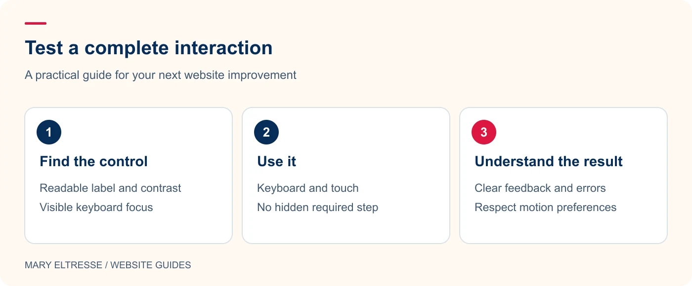
Example: Hypothetical example: A content slider pauses when hovered but offers no keyboard pause control. Add a clearly labeled control that works by keyboard and touch, show focus visibly, and test whether automatic movement respects reduced-motion preferences. Then check that the content remains readable when movement is paused. A polished animation is only one part of the interaction.
3. Treat motion as an enhancement
Use animation to support orientation rather than as a gate before content becomes visible. Respect reduced-motion preferences and offer practical pause controls for automatically moving sections. Test what happens when a slider receives focus or a user interacts with its contents. A decorative transition should not reset input or pull the reader away from the current task. If a heading link scrolls smoothly, ensure that the target remains clear and that a reduced-motion preference can avoid the animated movement.
4. Give forms clear labels and useful feedback
Use visible labels and explain any unusual requirement before the user submits the form. Keep validation feedback close to the relevant field and make the result understandable without depending solely on colour. Test keyboard access to verification controls and the final submit action. The WPForms reCAPTCHA label article addresses one specific customisation, but the whole form still needs a practical review. Adding a label to one component does not establish that the entire enquiry journey is accessible.
Example: Hypothetical example: A form marks an invalid field with a red border only. Add a readable message describing the problem, associate it with the field, and preserve the entered values. Test the complete correction journey by keyboard. Clear feedback helps visitors understand what to fix without depending on color perception alone.
5. Test layouts under realistic pressure
Increase text size, try a narrow screen, and use unusually long headings or names. Check whether labels disappear, buttons overlap, or horizontal scrolling becomes necessary for ordinary content. A useful fallback keeps the same task available when a newer CSS enhancement is absent. Review the content order in the document, not only its visual position in a grid. Choose a few representative devices and states and record them so a later redesign does not repeat the same discovery work.
6. Combine tools with a human review
Automated checks can identify certain issues, but also complete real journeys and review the content. Read instructions aloud, inspect link wording, and ask whether the confirmation message actually answers the visitor’s question. Document what was checked and what needs specialist testing. Avoid attaching an unsupported compliance badge to the site after a quick scan. My website handover guide can help define who owns future fixes and how content editors should report problems.
Your practical checklist
- Complete the main tasks using only the keyboard.
- Check focus visibility, labels, and selected states.
- Review text and control contrast in real combinations.
- Respect reduced motion and provide pause controls when needed.
- Test form errors and successful submissions.
- Try larger text, narrow screens, and long content.
- Record the review scope and unresolved accessibility work.
Frequently asked questions
Will an accessibility plugin fix every problem?
No. Tools can help with particular checks or features, but structure, content, design decisions, and custom interactions still require review and appropriate implementation.
Can these seven checks prove compliance?
No. They are a practical starting point. A full assessment needs a defined scope, relevant standards, and a more complete evaluation of the actual website and its tasks.
Make your next website improvement count
Want accessible web design considered throughout your next WordPress project? Contact Mary Eltresse to discuss practical testing and maintainable improvements.