

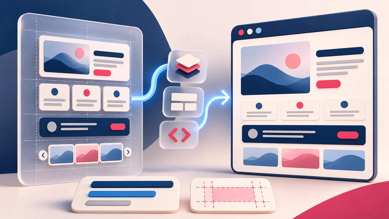
A Figma to WordPress handoff works better when it explains how the website behaves, not only how a single frame looks. The developer needs to understand the reusable parts, the content model, the responsive choices, and the exceptions. Clear context also makes AI-assisted implementation more useful, because generated code still needs to fit the project instead of inventing its own design system.
What changed in 2026
Figma’s August 2026 workflow article explores how richer design and code context can help teams work with coding agents. It uses an illustrative workflow rather than a guarantee of production-ready output. For a WordPress project, the practical takeaway is to prepare components, variables, behaviour, and review criteria so the implementation has a clear brief, whether the work is manual or AI-assisted.
Source: Figma workflow lab: moving between design and code with agents. News context checked November 15, 2026.
1. Start Figma to WordPress planning with content
List the types of information the site needs to manage: services, articles, resources, testimonials, and membership content where relevant. Decide which fields an editor should change and which parts belong in a shared template. A row of visually identical cards may represent very different content relationships. Clarifying that distinction early prevents a beautiful design from becoming a collection of manually duplicated pages that are difficult to update. Use actual sample content to test the proposed structure before implementation.
2. Identify reusable components and design tokens
Name the main components consistently and show their important states. Record the colour palette, typography scale, spacing decisions, and border treatments that should become theme settings or reusable styles. Avoid treating every measured pixel as a separate design decision. A small coherent system is easier to map to Gutenberg, a custom theme, or a builder. If a component is intentionally different, say why. That explanation is more useful than leaving the next developer to infer an exception from a screenshot.
Example: Hypothetical example: A Figma service card looks balanced with a two-word title. Before building it, add a long title, a missing image, and a longer description to the design review. In WordPress, test those cases with reusable blocks and flexible spacing. This reveals layout constraints before an editor encounters them on a real page.
3. Specify responsive behaviour between the frames
Show how navigation collapses, how cards wrap, and what happens to a two-column section when there is less room. Include a long heading and a missing-image example. State which content must remain visible and which decoration can be simplified. The desktop and mobile frames are useful endpoints, but the website must also behave at intermediate widths. Review those transitions during development rather than discovering them at the end when the structure is harder to change.
4. Explain interactions and accessible states
Document focus, hover, selected, loading, empty, and error states for controls that need them. For a filter, explain whether it searches the whole collection or only loaded cards. For a modal, explain how it opens, closes, and returns focus. Keep essential instructions in readable content. A design handoff should make the visitor’s task clear enough that the developer does not have to invent behaviour while implementing the layout. Include a keyboard-based acceptance check for the key journeys.
Example: Hypothetical example: The mockup contains several slightly different blue buttons. Agree on the intended primary and secondary styles, then map them to theme presets and reusable block styles. Show the owner which settings they can edit safely. Document the decision so future pages do not gradually rebuild the same component with conflicting colors and spacing.
5. Review generated code as project code
AI-assisted code still needs checks for maintainability, permissions, responsiveness, and compatibility with the chosen WordPress architecture. Compare the output with existing components before introducing new patterns. Reject hard-coded content where the design requires an editable field or a dynamic query. Do not accept a screenshot match as proof that the resulting block can be reused safely. My plugin evaluation questions also apply to generated dependencies: understand what problem each piece solves and who will support it.
6. Finish with a useful acceptance checklist
Compare representative pages with real content, test key tasks, and agree which intentional differences are acceptable. Keep a short list of items that are still unresolved rather than calling an unfinished review complete. Hand over the location of styles, the reusable components, and the editing instructions. The website handover article expands on these questions. A successful Figma to WordPress project leaves the client with an understandable system, not just an attractive collection of launch-day pages.
Your practical checklist
- Confirm the content model before translating the layouts.
- Name reusable components and agree on shared design tokens.
- Specify behaviour between mobile and desktop frames.
- Include keyboard, empty, loading, and error states.
- Review AI-assisted output against the actual project architecture.
- Agree on acceptance criteria and practical editing guidance.
Frequently asked questions
Should every part of a Figma frame become a custom block?
No. Use native blocks and theme settings where they express the design well. Build custom functionality when there is a real editing or behaviour requirement.
Can a coding agent replace the design review?
No. It can assist implementation, but the team still needs to check behaviour, content, accessibility, and whether the result fits the project’s reusable system.
Make your next website improvement count
Need a Figma to WordPress implementation that stays editable and maintainable? Talk with Mary Eltresse about the design, content model, and handoff you need.